Iron Flask CMF Strategy
Iron Flask was the first water bottle brand to have an ombre gradient on their powder coated bottles. Since then, the market has become saturated and the Iron Flask voice has become muddled with fast follow colors and patterns. The goal was to refresh the Iron Flask core colors and create a new strategy for seasonal color and patterns that would make Iron Flask a trend forward brand.


Iron Flask quickly became the number one selling water bottle brand on Amazon after launching a successful line of ombre gradient colors. I created renderings of all of the current color offerings to have a more cohesive representation of all colors for visualization for presentations.

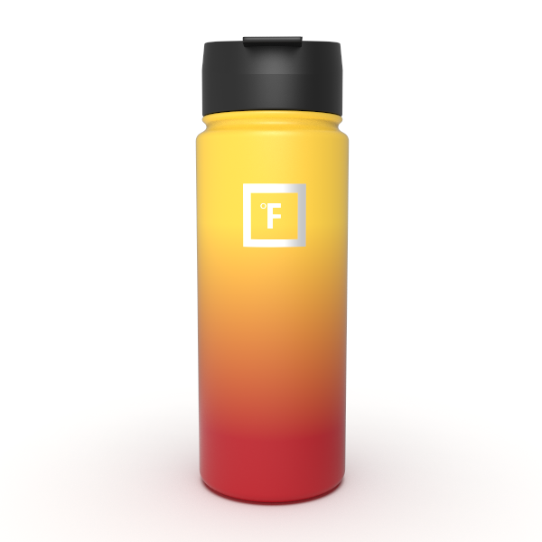

The goal was refresh the current color and pattern offering. I was to define and introduce the core neutral colors for the brand and new color and pattern vision. I worked closely with the brand manager to define current best sellers and how to incorporate those colors and patterns into the new palette. Shown here is the current color assortment: too many color choices and no cohesion between color and patterns.

I started off with trend research, looking to fashion as well as trends found in social media for inspiration for color and pattern. This is an example of my thought process (created in Miro). A collection of inspirational images along with visualization of the colors and patterns on product to further convey the concepts.
More to come…